
See the finished siteThe redesign is live. Open it in another tab, scroll the whole thing, then come back and I will walk you through the decisions behind it.
Captured by Friends has one of my favourite pitches in the wedding business. Traditional videographers start around $4,000 and hover in the corner all day. CBF ships you a box of camcorders, your friends film the wedding through their own eyes, you ship the box back, and a few weeks later you get an edited film for a quarter of the price. It is fun, it is a little rebellious, and it is genuinely more affordable.
The old site did not tell you any of that in the first eight seconds. It was not broken and it was not ugly. It was just quiet, and quiet is the one thing this brand is not.
The brief
Make the page feel like the product.
Job: fun and budget-friendly, without ever looking cheap
The old homepage set one serif for everything, from the logo to the buttons to the fine print. A single flat blue-grey wash ran from top to bottom. The hero ran a video across the full width, but a solid text box sat over the middle of it, covering half the footage so you never quite got to watch the thing you came to see. And "How it works" was a wall of paragraphs you had to actually read to understand.
None of it is wrong. All of it is muted. It reads like a tasteful traditional videographer, which is precisely the thing CBF is the cheerful alternative to. The whole redesign came down to one sentence:
Everything below is in service of that. Not louder for the sake of it. Warmer, faster, and more clearly the affordable, joyful option, on purpose.
Move 01
Two voices instead of one.
Job: use type to say "playful and affordable" before a word is read
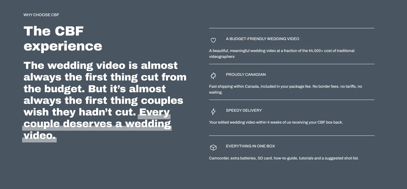
Type is the fastest way to set a price expectation. All-italic-serif is the visual language of the $4,000 videographer, the wedding invitation, the tasting menu. It is beautiful and it quietly whispers expensive. That is the exact wrong whisper for a brand whose entire point is that it costs less.
So we split the voice in two. A clean, friendly display face does the heavy lifting: the big headlines, the buttons, the step numbers, anything that needs to feel modern and easy. The elegant italic serif stays, but it becomes a guest instead of the whole cast, used for accents like crafted by us and the softer, romantic lines.
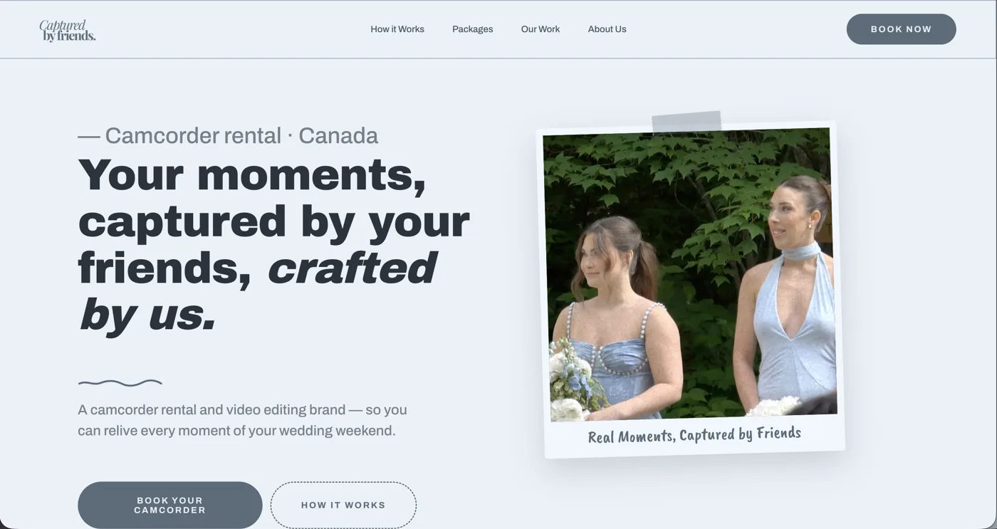
The result is a page that reads as approachable first, romantic second, which is the exact order a budget-friendly wedding brand wants those two feelings to arrive in.
The trap we avoidedRipping the serif out entirely and going full sans. That would have thrown away the wedding warmth and made it look like a tech startup. The goal was never to remove the elegance, only to stop it from setting the price.
Move 02
Keep the blue. Give it some life.
Job: same colour family, more range, so it stops feeling like one flat wash
The brand is blue, and it should stay blue. That was never in question. The problem was not the colour, it was that there was only one of it. The old page ran a single slate-blue wash from the header to the footer, so nothing had any depth and nothing stood out, because when everything is the same tone, nothing is emphasized.
We kept the exact same slate-blue heart of the brand and built a proper range around it: a deep, near-charcoal blue for the serious sections, the mid slate for the body, and a light ice-blue for breathing room and highlights. Warm off-white paper between the blue sections lets the whole thing exhale. Same identity, more contrast, more life.
The trap we avoided"Colourful" does not mean rainbow. On a wedding brand, a confetti of unrelated colours reads as chaos, not joy. The life comes from a wider range of the same colour, plus warm paper, not from adding new hues.
Move 03
Show the film, do not describe it.
Job: prove the product is good the instant the page loads
Here is the strangest thing about the old site. It sold wedding video, and there actually was a video in the hero, playing full width across the top of the page. But a solid box of text sat right over the middle of it, covering half the footage. So the one thing a couple most needs to see, proof that the film looks good, was the thing the layout was hiding.
For a company whose entire product is the finished film, that is the single biggest missed opportunity on the page. So the new hero lets the work breathe: the video and the words share the space instead of fighting for it, the headline sits to one side, and a real wedding frame is taped up beside it like a polaroid. Before you read a word, you can actually see what you are buying and how good it looks.
We carried that all the way down. Real frames from real weddings, actual footage instead of stock, woven through the page so the proof is everywhere, not parked on a hidden portfolio tab nobody clicks.
Why this matters more than any copyYou can write "cinematic, professional, beautiful" a hundred ways. None of them convince like four seconds of the actual film playing while someone decides whether to trust you.
The trap we avoidedA video hero that fights the page. It is muted, it loops, it never grabs the scroll, and there is a real reduced-motion and mobile fallback so it never becomes the thing standing between a couple and the "book" button.
Move 04
A custom polaroid scroll animation.
Job: turn the portfolio into a moment you feel, not a grid you skim
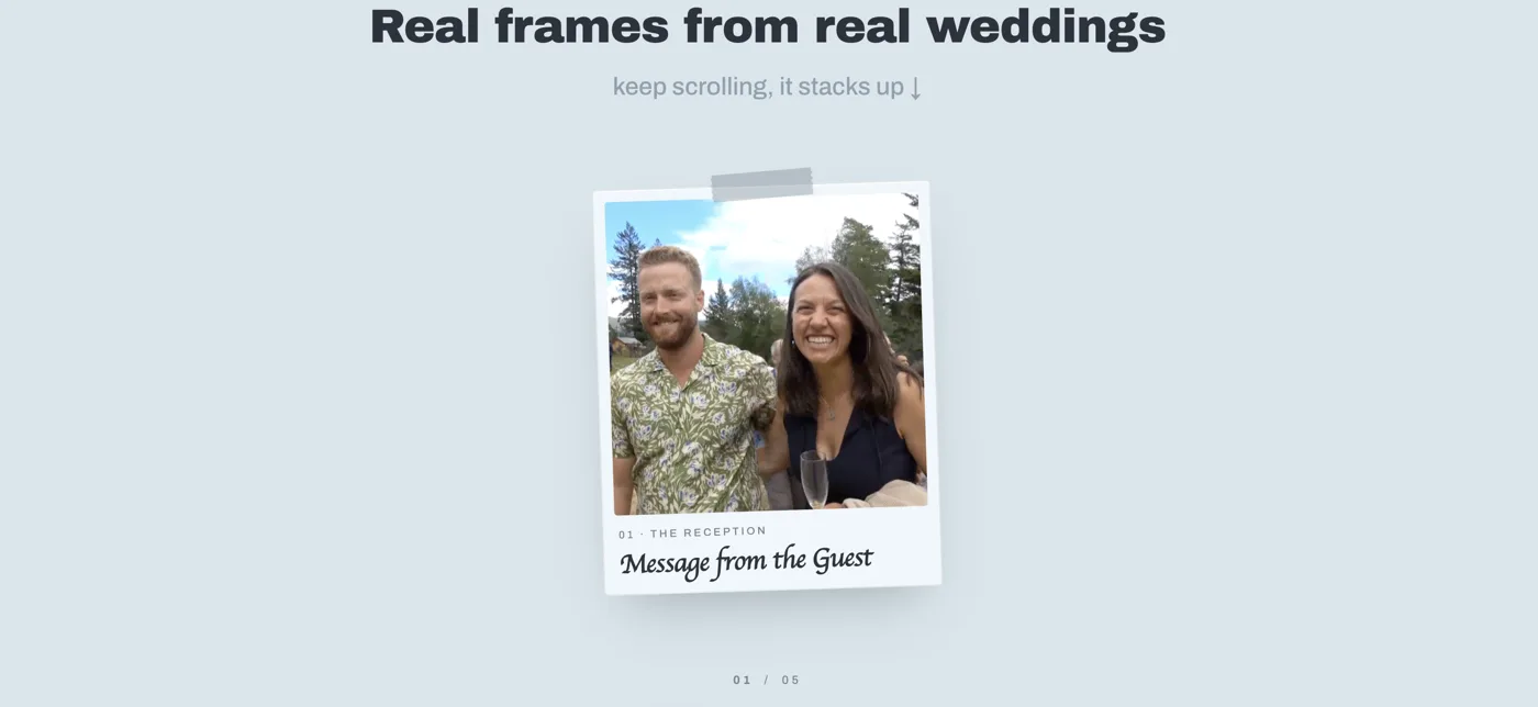
This is my favourite part, and it is the piece you cannot buy off a template. Under "Real frames from real weddings," the wedding photos are built as polaroids that stack as you scroll, one landing on top of the next like someone dealing you a pile of prints across a table, each one labelled with its moment: the reception, the first kiss, the toast, the last dance, the vows.
Mechanically it is a cousin of the wallet-stacking effect I wrote up last time: a pinned frame, the scroll position reduced to a single number, and each polaroid animating within its own slice so the whole thing scrubs cleanly forward and back. But dressed as instant-photo prints on a warm table, it stops being a "web effect" and becomes something that feels like the brand: candid, hand-passed, a little imperfect, exactly like handing a camcorder to your cousin.
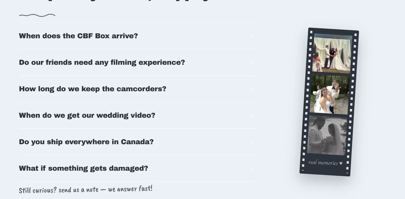
The same scrapbook instinct runs through the rest of the page. Down in the FAQ, the wedding stills sit inside a vertical strip of camcorder film, complete with sprocket holes and a handwritten real memories caption, so even the "boring" questions section carries the feeling of the product.
The trap we avoidedMotion for its own sake. The stack earns its keep because it maps to the product, and it still collapses to a plain, readable set of photos for anyone on reduced motion or a small screen. Delight never costs access.
The result
Same brand. Finally sounds like itself.
Nothing about the identity got thrown out. Same name, same blue, same warm, romantic streak, same wonderful pitch. We just gave the page a second typographic voice, a real range of that one blue, its own product playing in the hero, and one custom moment of motion that only this brand could own.
The old site looked like a videographer. The new one looks like what CBF actually is: the fun, affordable, proudly Canadian way to end up with a wedding film you will actually watch. The page and the product finally agree with each other.
Want a site that sounds like your business instead of everyone else's?
If your website feels a little quieter than the thing you actually sell, too formal, too flat, too much like your competitors, that is a fixable problem, and it is the one I like most. Send me your URL and I will tell you where the page and the business have drifted apart, and what I would do about it. Know someone whose site needs this? Send them my way.
Start a project with Bench →Or write me directly: mat.steenwinkel@benchdigital.ca